Getting More and Better Reviews for Your Business Online
Online ratings are clearly vital to today’s businesses. They help consumers find products, services, and brands to s...
Read More
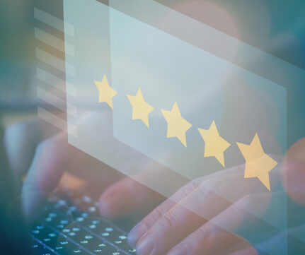
Online ratings are clearly vital to today’s businesses. They help consumers find products, services, and brands to s...
Read More
Give yourself a numerical advantage when it comes to attracting and keeping customers. Reaching your consumer is the m...
Read More
Is your video being read properly? With more visitors likely to buy or embrace your products after watching an online ...
Read More
“I would have answered your letter sooner, but you did not send one.” -Goodman Ace No doubt that the digit...
Read More
So many things go into the perfect content marketing strategy. When it comes to adding words to your landing page, sub...
Read More
APRIL 17, 2023 Since its launch in 2003, Aggro Creative Marketing agency has provided businesses across the ...
Read More